SOUNDS JUICY
Gig Poster Case Study

PROJECT GOALS
For this project, my goal was to create a concert poster for a fictional band. I wanted it to feel just as fun and eye-catching as something you’d actually see on a venue wall. I pulled inspiration from the kind of music I love the most, which leanes upbeat, pop-heavy, girly, and fun. I wanted the poster to feel like a burst of personality with bright, bold colors and full of that playful energy you get from a good pop song.
FINDING INSPIRATION
")
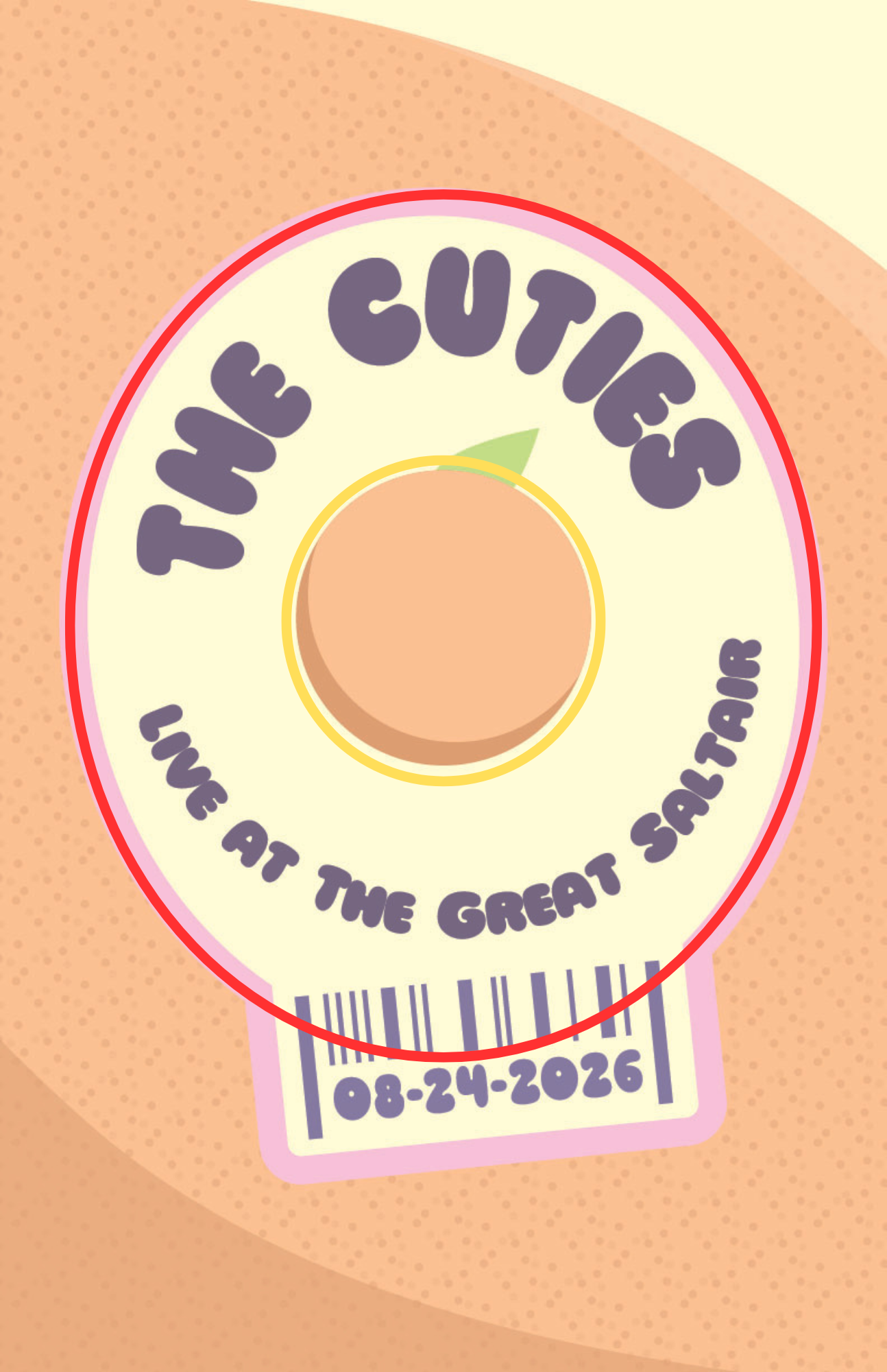
While scrolling through Pinterest for ideas, I came across a bunch of fruit stickers that really inspired me. The simple shapes, bright colors, and playful typography almost felt like they were begging to be turned into a gig poster. Each sticker already had ingredients that translate perfectly into design work. The main elements of text, icon, and barcode imidiately got my creative juices flowing.


SKETCHING LOTS OF IDEAS
A lot of my early sketches came before the fruit sticker idea officially clicked, but even then you can see I kept drifting toward fruit themes. Something about the shapes and textures just felt fun to play with. As I experimented with different compositions, the concept of using a fruit slice or peel with a sticker on it started to stand out. It gave me a clean focal point while still keeping that playful energy.
Zooming in on the fruit sticker ended up being the strongest direction. Showing it close-up with just a hint of the fruit’s skin behind it created a bold, graphic look that matched the vibe I wanted. It was simple, bright, and instantly readable—everything a gig poster should be.


First Draft and Edits
I was really excited about where the first draft was going, but something still felt a little off. To get a fresh perspective, I reached out to my mentor for feedback, and his notes helped me understand exactly what needed to shift. He pointed out three main things…
Conflicting Shapes
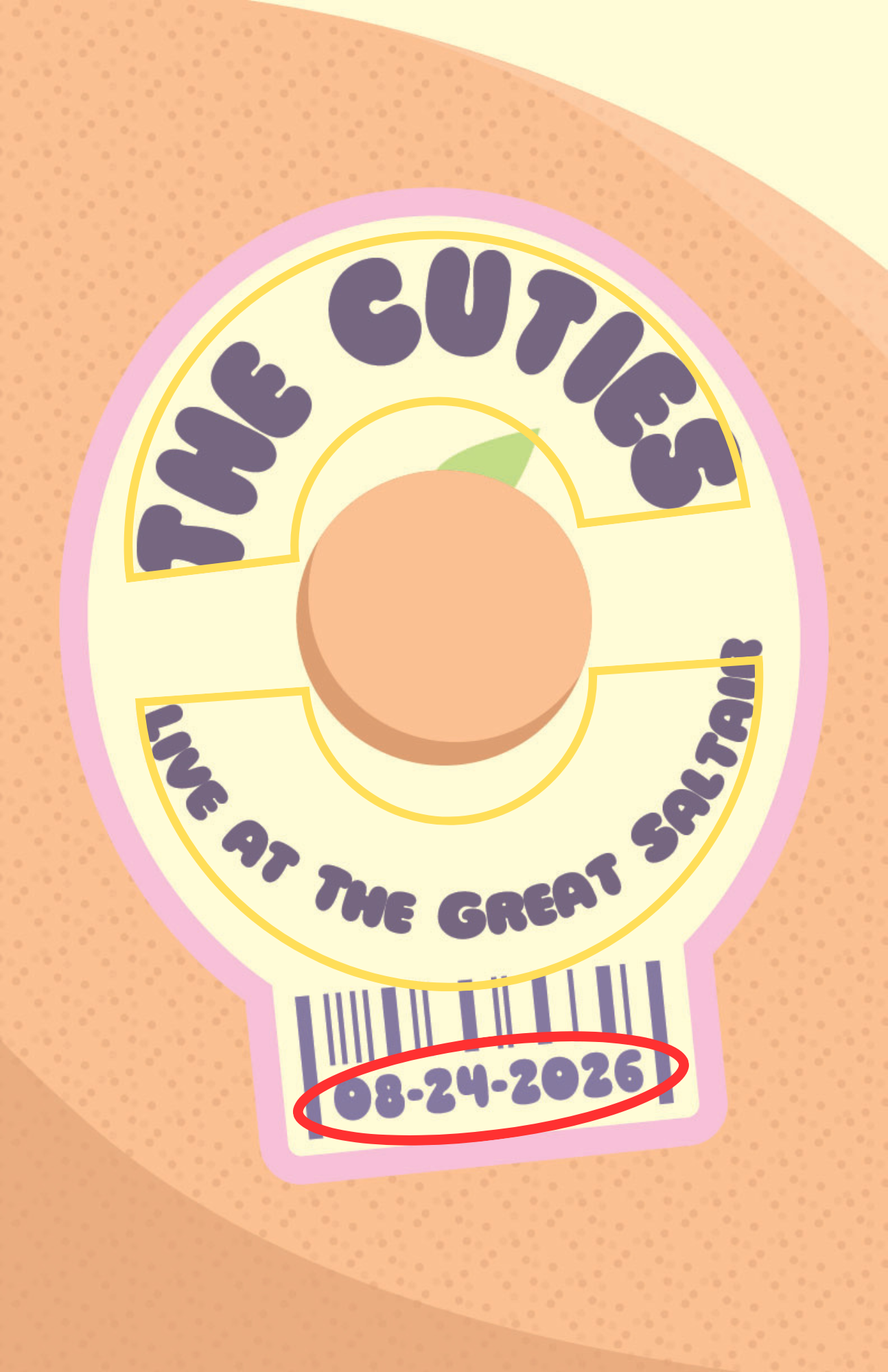
First, the oval shape of the sticker didn’t flow well with the angled text and the perfectly round orange in the center. The two together made the sticker a little unbalanced visually and distracted from the main idea.
Clashing Fonts
Second, the numbers underneath the barcode were using the same font as the main text. At such a small scale, it made them harder to read, and it didn’t capture how a real barcode looks.
Too Much Empty Space
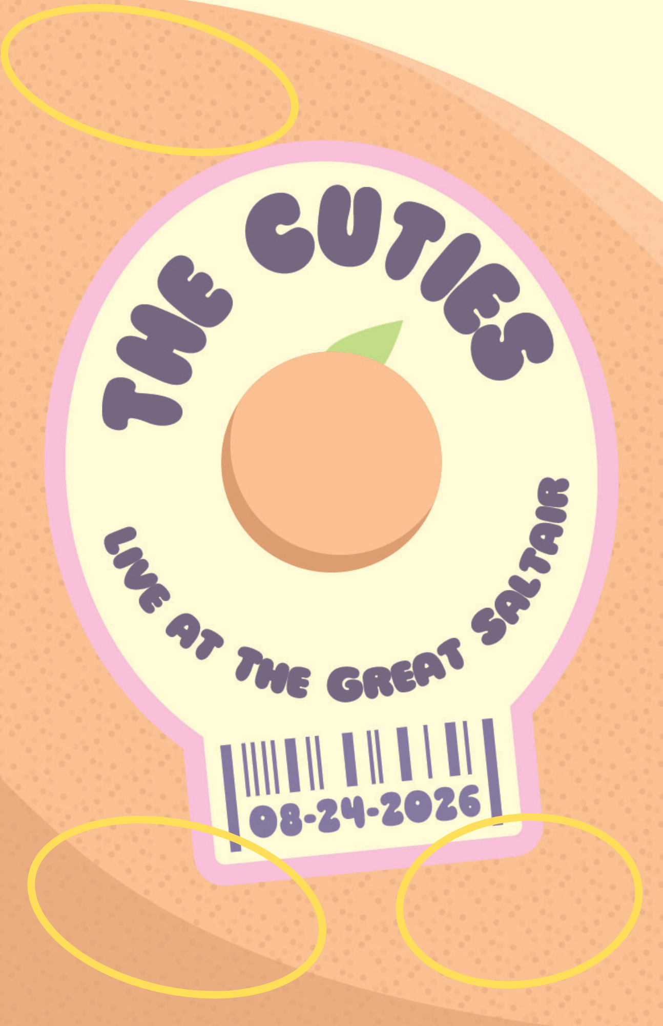
Finally, he mentioned that the very top and bottom of the poster felt a bit empty. Adding another sticker, and maybe leaf, could pull the eye around the whole composition and give the layout more intrest.
Remember the goal: Pop, Bright, Eye-Catching, Girly, Fun, Up-Beat
THE FINAL DRAFT


With all of that feedback in mind, I jumped back into Illustrator and started making edits until everything felt just right. I tweaked the shapes, changes the fonts, and added a few more elements to fill out the design.
TA-DA!


In the end, this poster accomplished exactly what I set out to create. The pastel colors capture the essence of girly pop, the texture and style embody fun and up-beat, and the fruit elements inspire the feeling eating a juicy fruit a.k.a pure joy! All together, it makes a great poster that someone would be proud to hang on their wall after going to the best concert ever.

Let's Work Together
Hi! I am Kelsee Wrye, a creative and designer.
I grew up in Salt Lake City, Utah, where my mom gave me unlimuted access to craft supplies and fuled my imagination. During highschool, I continued my passion for learning and creating in all of my classes, but loved art and literature.
I moved to Rexburg to pursue an education in creation – getting my bachelors in Communications and English. I have spent several years studying writing, art, and design.
Let’s connect and create something awesome!